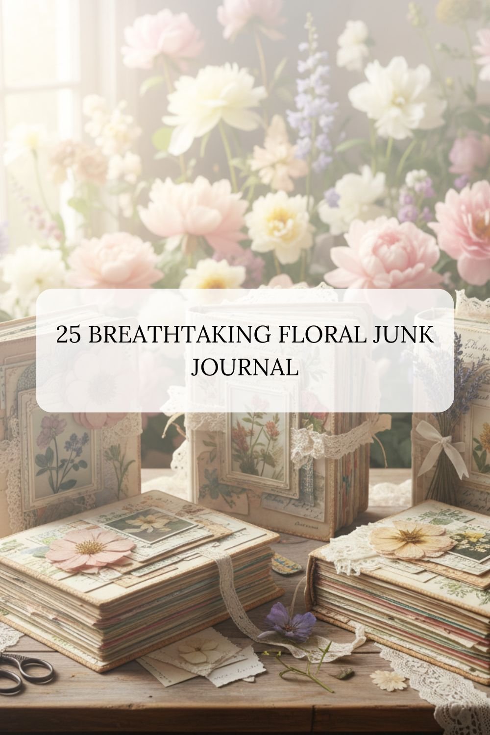
25 Breathtaking Floral Junk Journal Kits
This curated selection of 25 floral and vintage themes offers endless possibilities for your junk journaling journey. Whether you are drawn to the quiet elegance of Ivory and Grey or the vibrant energy of Teal and Gold, each kit provides a unique starting point for your storytelling. Happy journaling, and may your pages always be as beautiful as the flowers that inspire them!
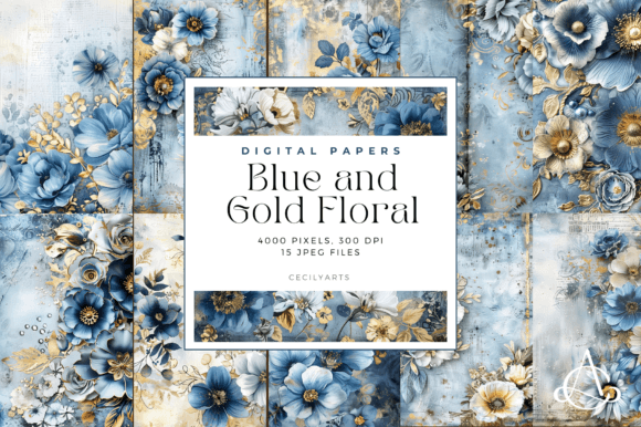
1.Blue and Gold Floral Junk Journal Pages
I love how the deep blues and shimmering gold accents give this floral journal a regal, midnight-garden feel. It’s my top choice for “luxury in decay” layouts or royal heritage themes. The best part is the metallic contrast; it adds instant depth without needing extra foil. Use it to create high-end covers or fancy divider tabs.
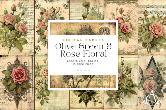
2.Olive Green and Rose Floral Junk Journal
This olive and rose combo is a personal favorite because it feels so grounded and organic. It’s perfect for a floral journal focused on herbariums or forest walks. I love using these pages for botanical studies where I want the greenery to pop as much as the blooms. The earthy tones act as a great neutral base for adding real pressed leaves.
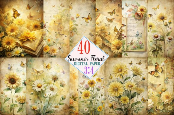
3.Summer Floral Junk Journal Kit Pages
When I want to capture that high-summer heat, this kit is my go-to. It’s bursting with bright, sun-soaked colors that make any floral journal feel alive and cheerful. I find it works best for documenting garden parties or vacation memories. The advantage here is the vibrant saturation—it really stands out and brings a fresh, happy energy to every page.
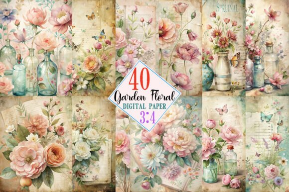
4.Spring Garden Floral Junk Journal Kit
There’s something so refreshing about these soft pastels and tiny buds. I use this kit whenever I want my floral journal to feel like a new beginning. It’s ideal for Easter layouts or tracking a growing garden. The light, airy backgrounds are a huge plus because they leave plenty of room for my own handwriting without looking cluttered.
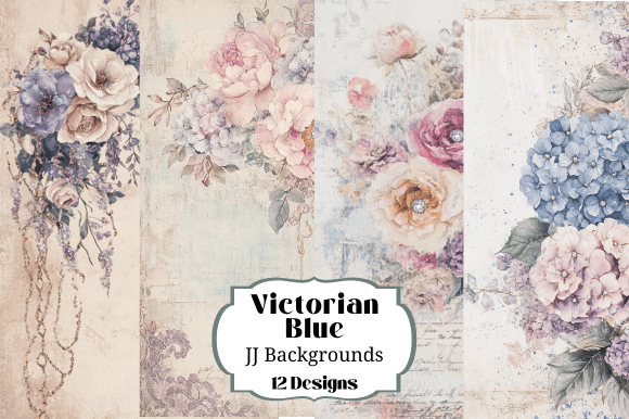
5.Victorian Blue Floral Junk Journal Backg
This kit is like stepping into a classic English tea room. The muted teals and intricate patterns make it a dream for a vintage floral journal. I usually reach for these when I’m working on “lady of the manor” themes or letter-writing spreads. The detail is so fine that the background does all the heavy lifting—no extra decorating required!
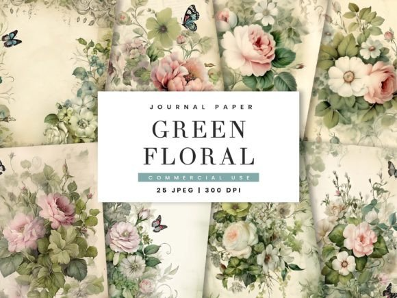
6.Green Floral Junk Journal Paper Pack
I’m obsessed with this pack because it’s all about lush, overgrown vibes. It’s a must-have for a floral journal that feels like a hidden greenhouse. I use it mostly for background layers or fussy cutting stems to frame my photos. The different shades of moss and emerald make it incredibly versatile for both moody and bright nature-themed spreads.
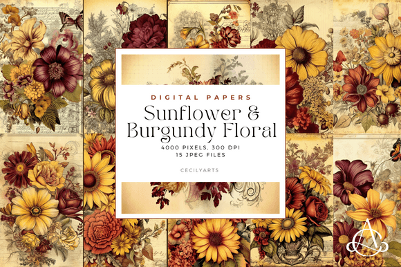
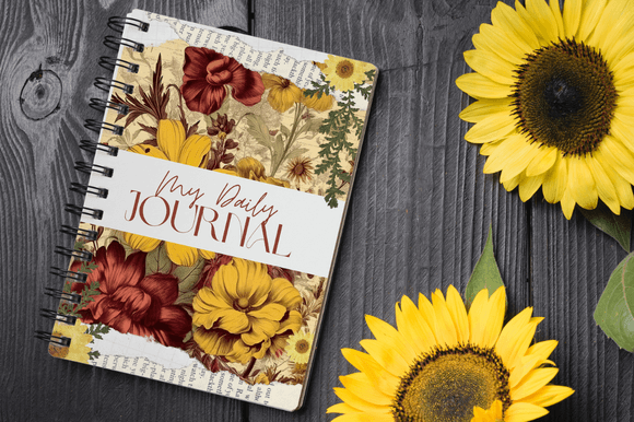
7.Sunflower Burgundy Floral Junk Journal
The rich burgundy and golden sunflower tones give this set such a warm, harvest-time soul. I love using it for a floral journal that feels cozy and “homegrown.” It’s brilliant for autumn memories or gratitude lists. The deep red contrast makes the yellow petals glow, which helps create a stunning focal point without needing any extra bulk.
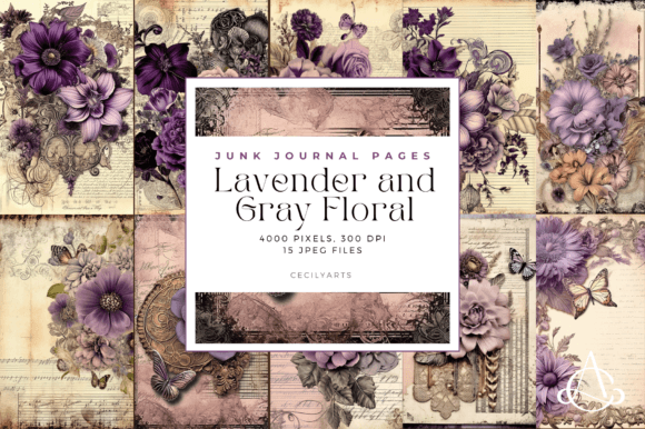
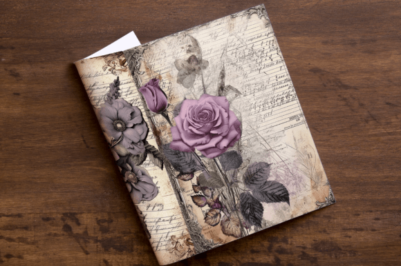
8.Lavender Gray Floral Junk Journal Pages
I find this palette so incredibly soothing. The dusty lavender against the soft grays gives my floral journal a misty, early-morning atmosphere. It’s my favorite for dream logs or quiet meditation pages. The best part is how the muted colors allow silver charms or lace to really shine, creating a sophisticated, peaceful look that isn’t too “busy.”
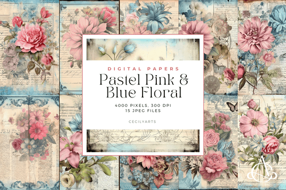
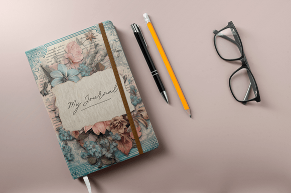
9.Pastel Pink and Blue Floral Junk Journal
This combination reminds me of a fluffy cotton-candy sky. I love using it for a floral journal that needs a soft, whimsical touch—it’s perfect for baby books or “sweetest memories” spreads. The gentle transition between the pinks and blues makes blending different ephemera easy. It’s my secret weapon for creating a light, dreamy atmosphere.
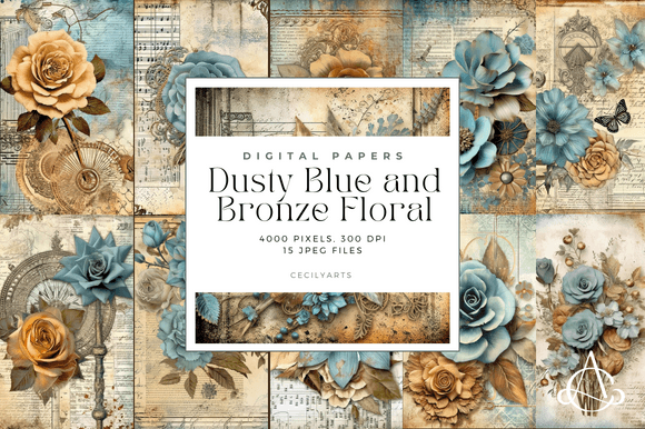
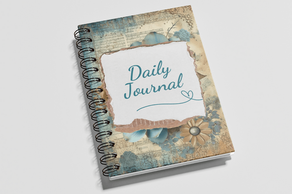
10.Dusty Blue Bronze Floral Junk Journal
There’s a vintage industrial elegance here that I just can’t get enough of. The bronze tones add a “weathered metal” feel that grounds the soft blue blooms. I use this for a floral journal that needs a touch of Steampunk or aged masculinity. The metallic-look textures are a huge plus—they give the paper a heavy, expensive feel.
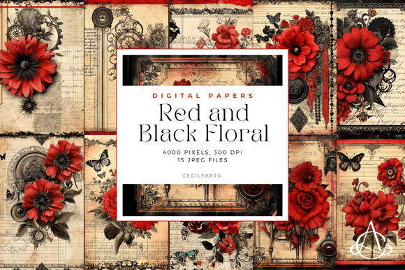
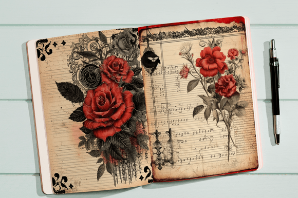
11.Red and Black Floral Junk Journal Pages
This bold combo is perfect for a gothic-themed floral journal. I love using it for dramatic covers or intense, romantic layouts. The contrast is sharp and moody, making red roses pop against the dark background. It’s my go-to when I want a page that feels passionate and mysterious without needing extra layers.
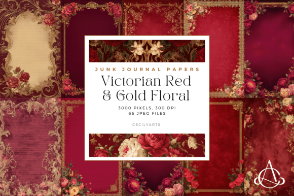
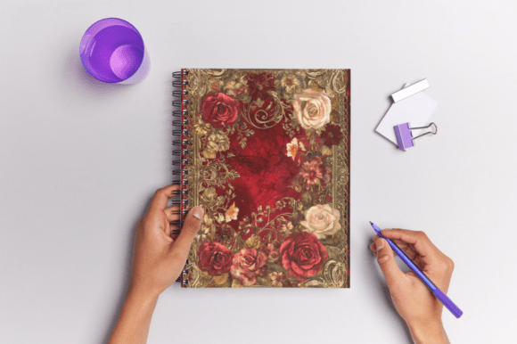
12.Victorian Red & Gold Floral Junk Journal
This set screams vintage luxury. I love the rich, velvety reds paired with ornate gold flourishes for a high-end floral journal. It feels like an old library book from a palace. Use it for “heritage” pages or special holiday memories—the deep colors make everything you glue on top look instantly more expensive and antique.
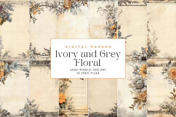
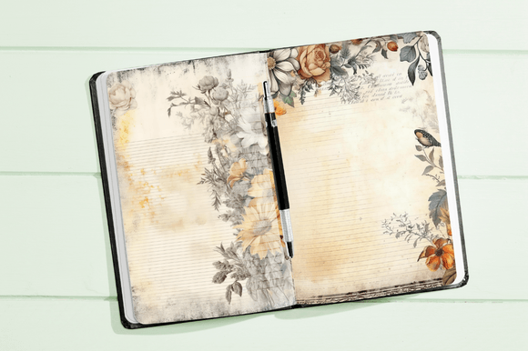
13.Ivory and Grey Floral Junk Journal
I love how understated and classy this set feels. It’s my top pick for a minimalist floral journal where I want a clean, sophisticated look. The neutral tones make it a dream for wedding layouts or chic daily logs. The biggest win? Any colorful ephemera you add will absolutely pop against the soft ivory and slate grey.
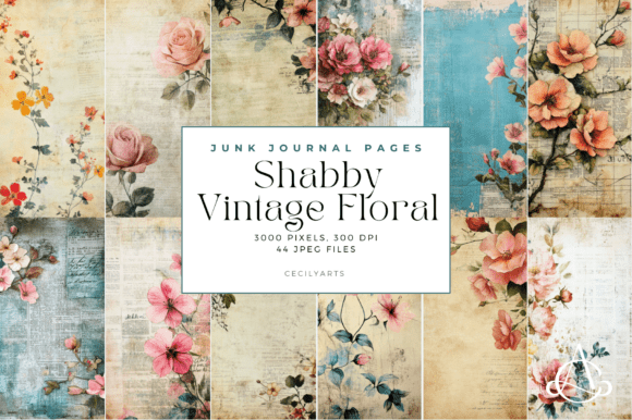
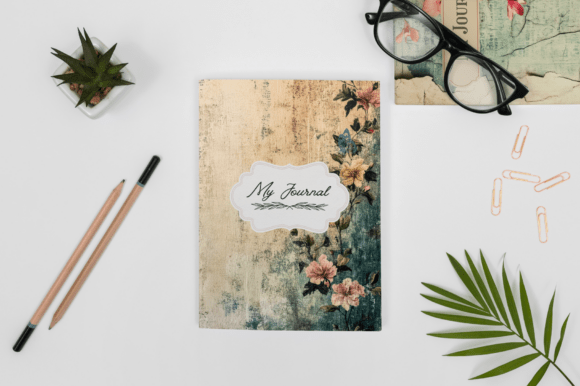
14.Shabby Vintage Floral Junk Journal Pages
I’m obsessed with that perfectly worn-in look. These pages give my floral journal a nostalgic, “found in grandma’s attic” vibe. I use them for heritage spreads or soft, romantic memories. The faded edges and distressed blooms mean you don’t even have to ink the paper yourself—the vintage charm is already built right in!
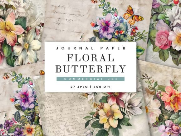
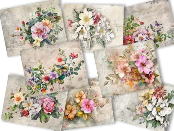
15.Floral Butterfly Junk Journal Paper
I love how the delicate wings blend into the blooms here. It’s my favorite for a floral journal focused on growth and transformation. I use these pages for “flight of fancy” spreads or spring themes. The butterfly motifs add great movement to the layout, so the page feels alive even before you start adding your own stickers.
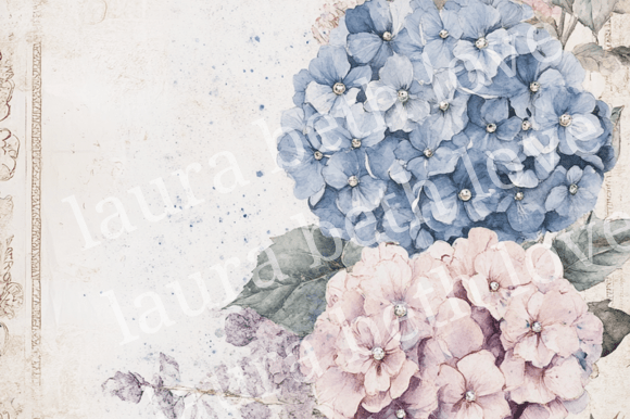
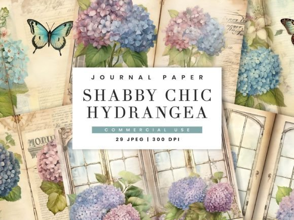
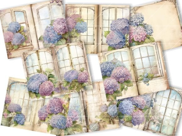
16.Floral Hydrangea Junk Journal Kit
Hydrangeas are the queens of volume, and this kit captures that perfectly. I use these for a floral journal that needs a lush, full look. The clusters of petals create a natural frame for photos or quotes. The big advantage is the soft blue and purple tones—they’re incredibly calming and fill up a page with beauty effortlessly.
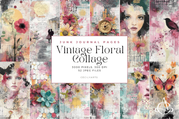
17.Vintage Floral Collage Junk Journal Page
I love how these pages do the layering work for me. It’s a lifesaver when I want a busy, artistic floral journal look without the bulk of real scraps. I use them as “instant bases” for quick spreads. The mix of old scripts and faded petals creates a beautiful, messy-on-purpose vibe that makes every entry look curated.
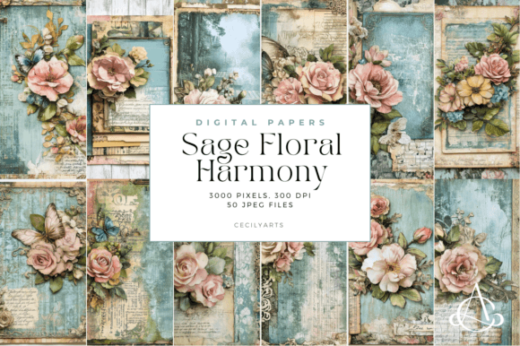
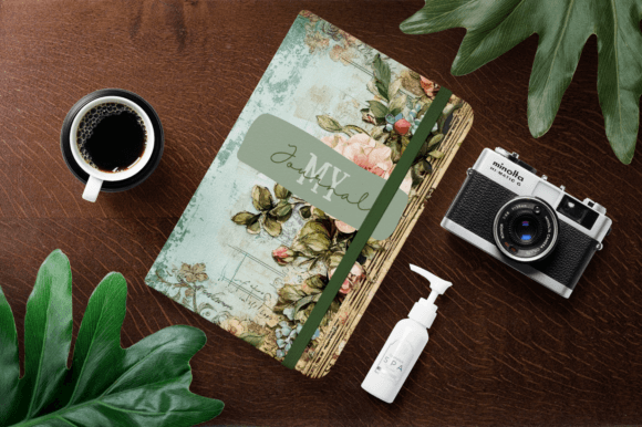
18.Sage Floral Harmony Junk Journal Pages
I’m a huge fan of this earthy, balanced palette. I use it for a floral journal that needs a grounded, botanical feel. The muted greens create a “garden herb” aesthetic that is incredibly easy on the eyes. It’s perfect for nature sketches or health logs because it feels so organic and peaceful.
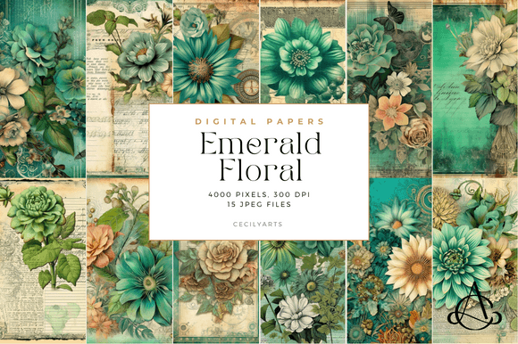
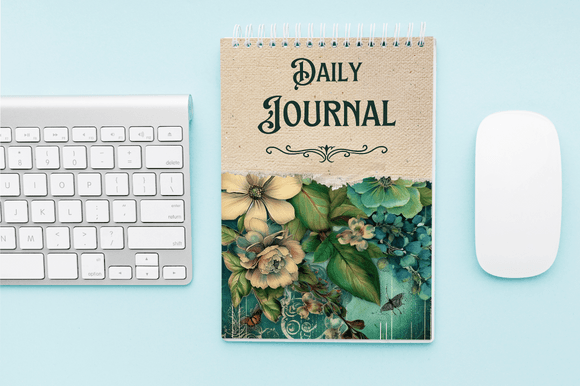
19.Emerald Floral Vintage Junk Journal Page
This kit is pure drama. I love using it for a floral journal that feels royal or enchanted. The deep jewel tones make white or gold ink really stand out. It’s perfect for night-time reflections or “enchanted forest” themes because the rich green background adds so much depth and mystery to every page.
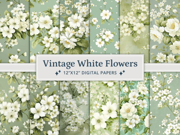
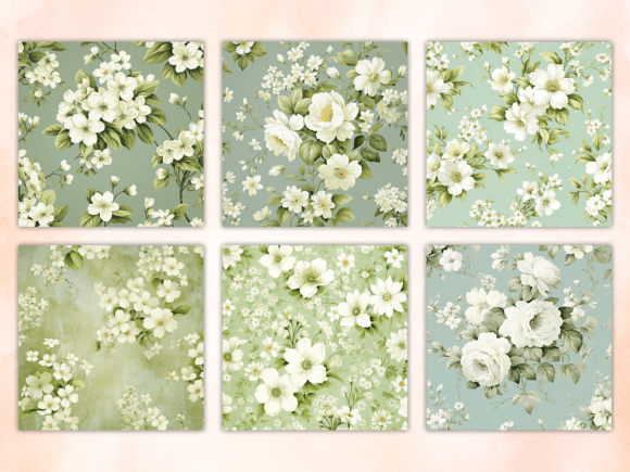
20.Vintage White Flowers Digital Paper
I love how clean and “ghostly” these feel. I use this set for a floral journal that needs a delicate, ethereal touch. The white-on-neutral designs are perfect for layering vellum or lace. It’s my favorite for winter botanical spreads or wedding memories because the simplicity keeps the layout feeling light and timeless.
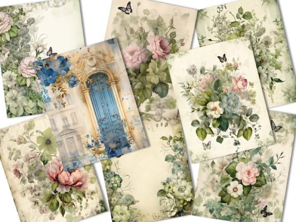
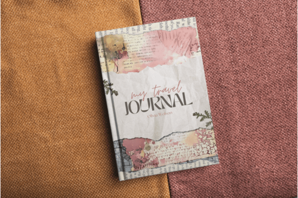
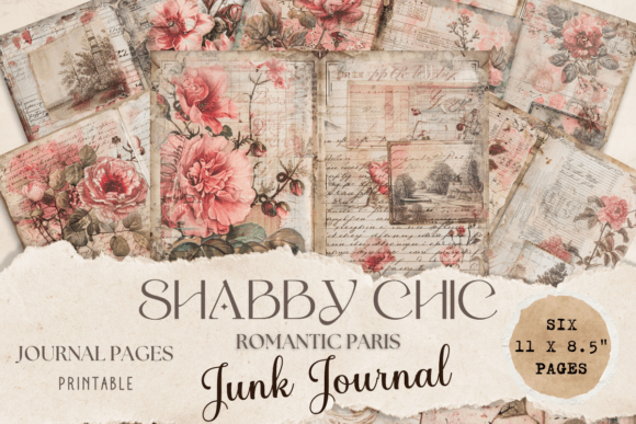
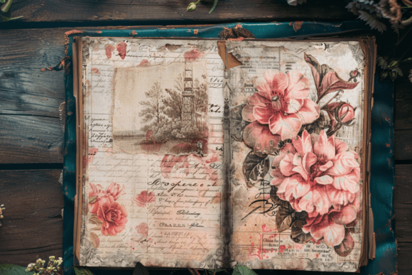
21.Romantic Paris Junk Journal
I love how this kit captures that “city of love” aesthetic. I use it for a floral journal when I want to feel like I’m sitting in a Parisian cafe. The mix of Eiffel Tower sketches and soft roses is perfect for travel memories or love letters. It’s an instant way to add a chic, European flair to any page.
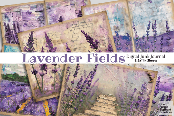
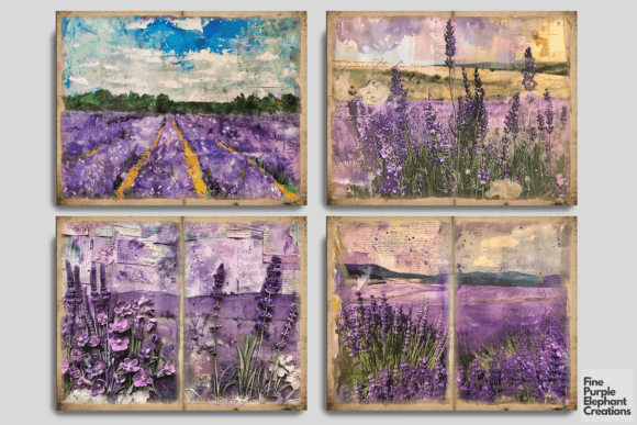
22.Lavender Floral Plant Field Junk Journal
I love how this kit feels like a breath of fresh air. I use it for a floral journal that needs a wild, open-countryside vibe. The endless rows of purple blooms make it perfect for summer travel logs or aromatherapy notes. It’s my favorite for “wide-angle” layouts because the field perspective adds amazing depth to the page.
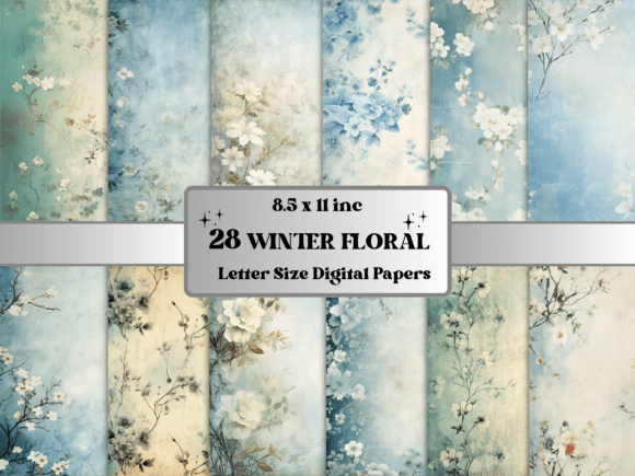
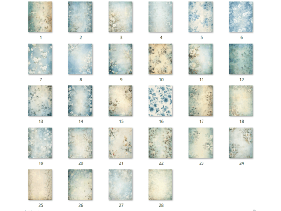
23.Vintage Winter Floral Digital Paper Pack
I love how these pages capture “frozen” beauty. I use them for a floral journal that feels cozy and quiet. The mix of icy tones and hardy winter blooms is perfect for December memories or New Year reflections. The best part? They add a seasonal touch without being too “Christmasy,” keeping the aesthetic elegant and cool.
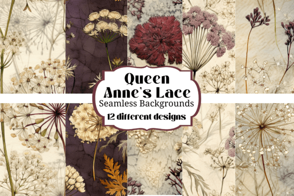
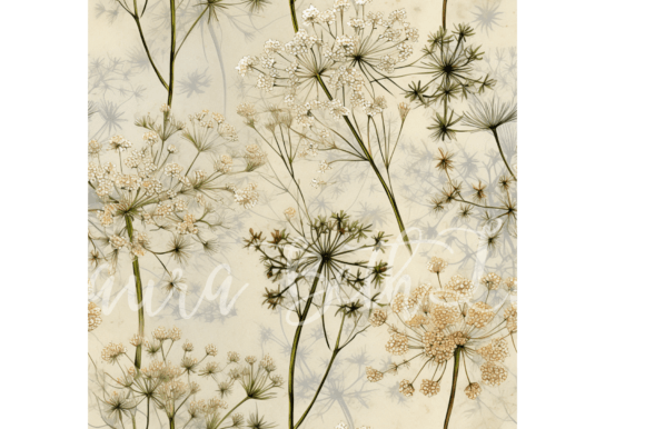
24.Queen Anne’s Lace Floral Backgrounds
I love how light and “airish” these look. I use them for a floral journal that needs a delicate, wildflower feel. The tiny white clusters are perfect for subtle backgrounds that don’t distract from your writing. They’re my top choice for a “meadow” aesthetic or soft summer memories because they make every page feel breezy and organic.
25.Teal and Gold Floral Posters & Patterns
I love how high-contrast and opulent this set is. I use it for a floral journal that needs a bold, “Art Deco” punch. The rich teal provides a moody depth, while the gold patterns add instant shimmer and sophistication. It’s my favorite for covers or artistic divider pages because it feels less like a notebook and more like a piece of gallery art.